

Interview 1: 24-year old waitress at a Thai restaurant
Target user recalls phone being an inconvenience as it is kept in the back and front pocket often. The desired task to be completed was to check text messages. The target user was too busy to grab the phone and while in the middle of another task finds it too much of a hassle to do so. In many cases, she recalls when someone messages her but often times finds it a hassle to check as the process usually goes: Unlocking iPhone < Press the Menu button to return to the Home Screen < Click on the Messages application < Click on the new message < Check to see if it is important, if it is important then reply. When they imagine preforming the same task on a wrist won touchscreen interface, she imagines that this interaction would be much simpler and easier to check messages involving less steps to do so.
A lesson learned from this individual interview would be that users would like some sort of separation of priority/important messages from their casual, normal social media or chat messages. I also learned that users would like a shorter process for reaching their applications and doing tasks.
Interview 2: 38-year old assistant at Kikkoman
Target user recalls the phone being easily forgotten when leaving the house. Usually her phone would be in her purse and since her purse is big, it sometimes goes unnoticed when her phone isn't there. When she does not have her phone readily available, she is miserable. The task she would like to do is to check her e-mails as well as access her contacts. She finds not having her phone for contacts extremely distressing as she only remembers names and not numbers.
Asking her to imagine performing these tasks on a wrist worn touchscreen interface she says that contacts would be great to have on the wrist so if she were to forget her phone she would still have her list of contacts available to her. As for e-mail, the user believes that the screen of the smart watch would be too small for e-mail.
A lesson learned from this individual interview would be that users would like shared information on both the phone and watch i.e, the list of contacts. It also seems that for e-mail, instead of displaying the whole content of the e-mail on the smart watch, perhaps we should cut down information output and display only the sender & the e-mail subject.
-----------------------------------------------------------------------------------------------
Summary of interviews: It seems that users would like to see shortcuts on a smart watch device rather than the same interface as that of a smart phone. In interview 1 we see that the user would like to see shorter process for completing tasks and in interview 2 we see that the user would like to have a shortcut to access their information. Overall, from these interviews it seems that the smart watch should be easier to use and require less steps to get information as well as limit the information that is displayed given the limitation of the screen space.
Brainstorm
1. Priority message pusher application
⁃ Attaching classifications of priority to the messages you send.
⁃ Have this universal rule of # of messages for importance.
⁃ 1 copy of the message means not very important, check whenever.
⁃ 2 copies of the message sent means somewhat important.
⁃ 3 copies of the messages sent means super important!!! Open & look now!
2. E-mail reader & summarizer application
⁃ When forward e-mails to smart watch, it should be limited in content, so we should summarize.
⁃ We should also be able to filter which e-mails are prioritized & forward to the smart watch by senders.
3. Walkie Talkie application
⁃ Convenient communication for on the go
⁃ More convenient than typing on the smart watch
4. Online video messaging application
⁃ Video messaging like FaceTime or Skype
5. Offline video messaging application
⁃ Video messaging like leaving a video message for the user to see
6. Picture messaging application
⁃ Image resolution perfected for the smart watch screen.
⁃ Messaging system of images
7. Pager application for notifying emergency situations
⁃ Bringing back the pager system. When you need them, page them to show important it is!
8. Professional business messaging application
⁃ Would be like e-mail but meant to limit amount of content to fit in smart watch screen space
⁃ Short and sweet; quick & to the point beneficial to both the employee and employer
9. To-do list with scheduler application
⁃ Like what the palm pilot used to do but better, have a list of your to-dos available on your smart watch
⁃ Include voice messages as notes
⁃ Include images as notes
⁃ Include documents as notes
10. Voice memo reminders application
⁃ Set yourself to remind yourself what to do i.e, to not forget your phone at 8:30 AM when you are leaving the house for work.
11. Unavailable/Busy forwarding application
⁃ 1-click touch to set your status on the smart watch as busy or unavailable
⁃ Setting it as so will let your messages be silenced and calls forwarded straight to voicemail, encouraged to leave a message
12. Preset messaging application
⁃ Program from your phone or on your watch common or general messages that you would like to have available to use as responses of messages on the watch
⁃ Having it as so solves the input issues of having to write or type, just click!
What I ended up choosing to work on:
My favorite idea: Idea #3 – Walkie Talkie application
I chose this one because it would seem like the best application for the smart watch given its limitation of the watch of screen size, input/output techniques, and so forth. Having voice communication would be better than text communication in the case of watches as the space is very limited for content of text as well as very limited for how you would input text.
Prototype construction process
A lot of arts & crafts time.
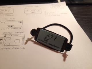
Why I chose this watch design: I wanted to go for a simple look without the huge, thick band. On hot days a wristband brings in extra heat + gives that "watch tan". In my head I see a watch with a thin black plastic PVC type material band. In my prototype I used a elastic hair band to represent this. I also wanted to have that watch as a thin sleek model, hence the rectangular shape.
Prototype testing with a user (my dad)
User testing & notes:
- Good idea for a watch application
- Too many buttons in the screen
- For buttons, limit it to at most 2 per screen
- Information is very compactly displayed
- Account for disabilities like vision impairment
- Most of the icons are decipherable
- 1 icon issue, bird logo as home button may be too ambiguous
- Could be quite convenient if implemented right
Test insights:
I wanted to test it with my father because he is quite old hence the perfect non-tech savvy subject that would give the best critique and comments. For my application idea I want it to be used anywhere and everywhere. The only intentions are building it for busy, time-consumed people. This application is meant to be a convenience application so I cornered my dad while he was relaxing with TV to ask for his opinions. From his feedback I learned quite a lot. For one, I realize that having buttons on the screen may limit the overall space. Space is already very limited so perhaps incorporating gestural input would be better in terms of user interaction with the smart watch. This eliminates button size issues with finger size problems. I also learned that using universal icons or even easy to read icons are very successful with users. There’s no frustration in having to figure out each button, which doesn’t deter the user. When my father saw the (poorly drawn) bird logo he spent a minute or two trying to figure it out before giving up to ask me. That was a red light for me as it’d be extremely annoying to have to decrypt a little button icon. After a minute, if users don’t figure it out it is almost always true that they will be discouraged from further use or attempts.

Comments