

Hardware components | ||||||
 |
| × | 1 | |||
| × | 1 | ||||
 |
| × | 2 | |||
Software apps and online services | ||||||
 |
| |||||
Update 08-15-2015: Project converted to Visual Studio 2015 RTM
Windows 10 IoT Core Realtime communication using PubNub
Windows 10 IoT Core and PubNub are great tools for makers, we can easily send and receive message to and from devices. The device can be controlled from outside world, the device ca communicate with other devices and make a network of devices, etc.. are possible.
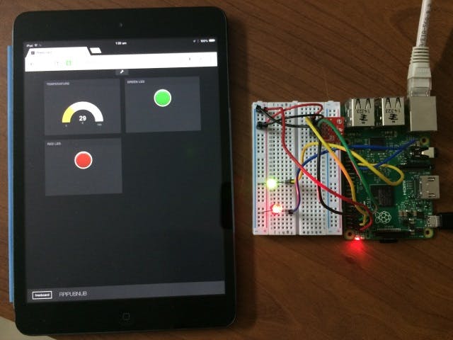
Last week I decided to experiment with Windows 10 IoT Core and PubNub. It was super easy and the result is amazing, we can have a realtime dashboard using Freeboard.io and also with a little bit tweaking you can control the LEDs attached to Raspberry Pi 2.
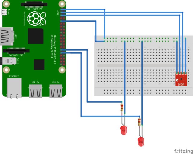
Here is the overview, the project uses TMP102 sensor to measure the temperature and publish it using PubNub. We can also send messages to Raspberry Pi to control the devices attached to it. Any client that subscribe to the channel rpipb-temperature will get realtime updates of the temperature. The message will be a JSON string in the form of {"temperature": 29}. We can also send messages to the device to control any external devices attached to it. You can turn on/off any GPIO pins available in Raspberry Pi. The message should be in the for of {"pin": <<pinnumber>>, "value": 1/0}. The pinnumber can be any GPIO pins, value can be 1 for HIGH and 0 for LOW. For this project I have attached two LEDs to pin number 5 and 6. Here are some examples of message:
{"pin": 5, "value": 0} - this will write value of LOW to GPIO pin 5 {"pin": 6, "value": 1} - this will write value of HIGH to GPIO pin 6
To display the live dashboard, I am using Freeboard.io. You can create your own dashboard using any library that support PubNub, say for example EON. For this project I am just using Freeboard.io. I have created a widget to display the live temperature updates. With little bit of tweaking I have also created two widgets with buttons to control the LEDs. For this I am using HTML widget and inserted the code to send PubNub messages.
Using the sample
- Open the solution
RPiPubNub.slnin Visual Studio 2015 - Replace the publish and subscribe keys with your keys
Select the
'Remote Device'option under the Debug TabRebuild the project and run it.
Steps to create live dashboard
- Logon to Freeboard.io
- Create a datasource with type
PubNub, enter the nameRPI-PubNub, enter your PubNub subscribe key and enter the channelrpipb-temperature. - Create a widget with type
Guage, enter the datasourcedatasources["RPi-PubNub"].Temperature, enter units, minimum and maximum. - Create a widget with type
HTML, open the.JS Editorand copy and paste the contentsREDLed.htmlfile (see below) and name it asRED LED. - Create another widget with type
HTMLopen the.JS Editorand copy and paste the contentsGREENLed.htmlfile (see below) and name it asGREEN LED.
Screenshots
Demo Video


_ef4Gg1O87a.png?auto=compress%2Cformat&w=40&h=40&fit=fillmax&bg=fff&dpr=2)

Comments