

Hardware components | ||||||
 |
| × | 1 | |||
 |
| × | 1 | |||
 |
| × | 1 | |||
 |
| × | 1 | |||
 |
| × | 1 | |||
Software apps and online services | ||||||
 |
| |||||
 |
| |||||
A VolumeControlSystem does just that. Using a Volume Control System, we can adjust the loudness of sound based on our requirement. A Volume Control System is used or integrated with a variety of hardware and software applications including, but not limited to, loudspeakers, amplifiers, headphones, televisions, mobile phones, etc.
Project Details:The user interface of the project is a web page, which can be accessed through a web browser on a desktop/laptop, or the Bolt Mobile App on an Android or iOS mobile phone.
In the web page, there is a slider and an OFF button.
With the help of Slider we can adjust the intensity of the sound and OFF button is used to Off the sound.
However, it is to be noted that once you reach the maximum amount of API requests, the Buzzer will stop working. Bolt Cloud services a limited number of API requests for each user in a specific period of time.If the user keeps on adjusting the slider or clicking the OFF button, they will exceed their API request quota and will be temporarily blocked from sending further requests.
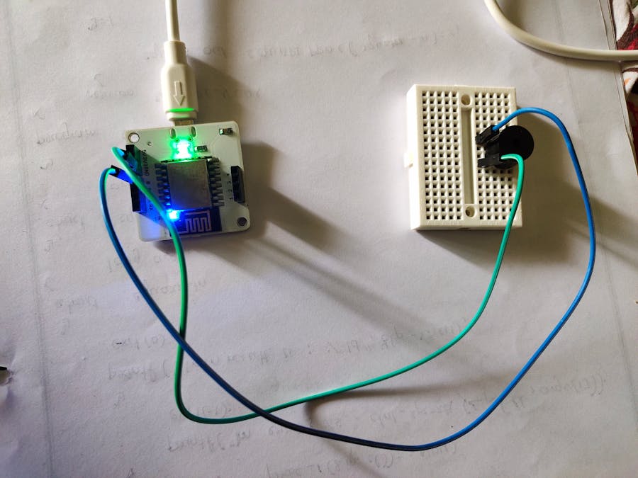
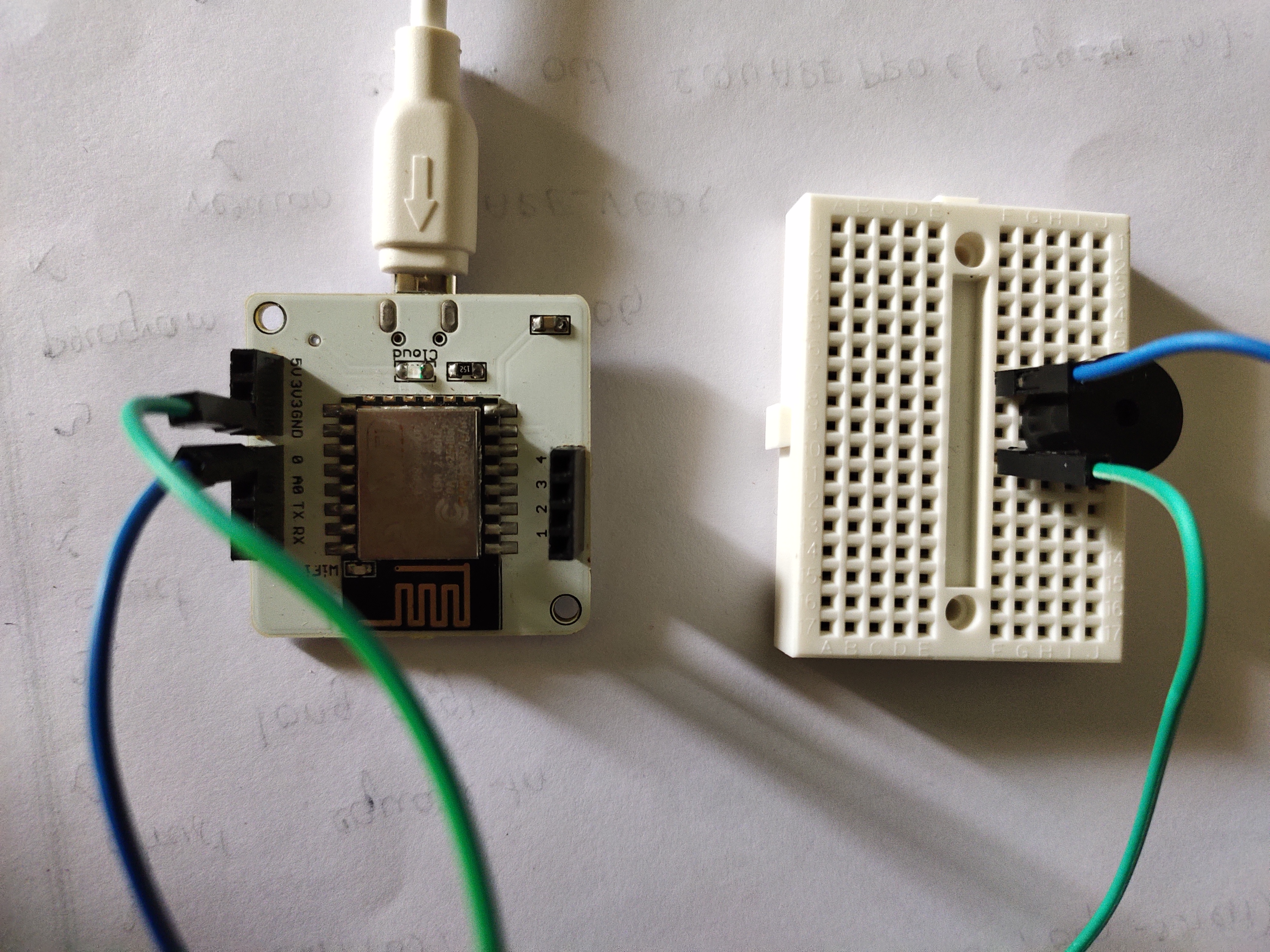
Steps to follow:ForBuzzer:
- Place the buzzer on the bread board. Connect the Positive leg(longer edge) of the buzzer to the 0 pin of bolt module.
- Connect the negative leg(shorter edge) of the buzzer to GND of bolt module.
- Connect the mini-USB male port of the USB cable to mini-USB female socket of the Bolt Wifi module. Connect the other end of the USB cable, i.e, the USB-A male port to a desktop/laptop or a USB-A to Socket adapter.
- Visit cloud.boltiot.com and log in to Bolt Cloud using your credentials.
- You should be directed to the Device page. This page will list all the available devices connected to your Bolt Cloud account and will also indicate whether they are Online.
- Go the Products tab by clicking on the Products icon on the left-hand side of the web page. This page will list all the available Products that you have made on the Bolt Cloud, if any.
Click on the Add Product button to create a new Product. This will open a Product creation menu.
- You need to select output device as buzzer is an output device and should give the product name and click o done button.
- You should be now in your Product's page. Click on the Link icon near the top-right side of the page
- Now, click on the configure icon near the top-right side of the page
- Since we are not taking any input from the Buzzer as it is an output device, we do not need to assign variables to any pin in the Bolt Wifi Module. Click on the Code button on the top of the page.
- Now you are on the code.In this we write code for the project by selecting extension as html and choose the file name as your wish.
- Save the code and exit from it.
- You should be now in your Product's page. Click on the Link icon near the top-right side of the page
- A dialog box will appear listing all the Bolt devices connected to your Bolt Cloud account. Select the device of your choice to link the Product to your hardware
- Now click on view this device to open a web page where we can operate the sound.
Output Looks Like:


Comments