


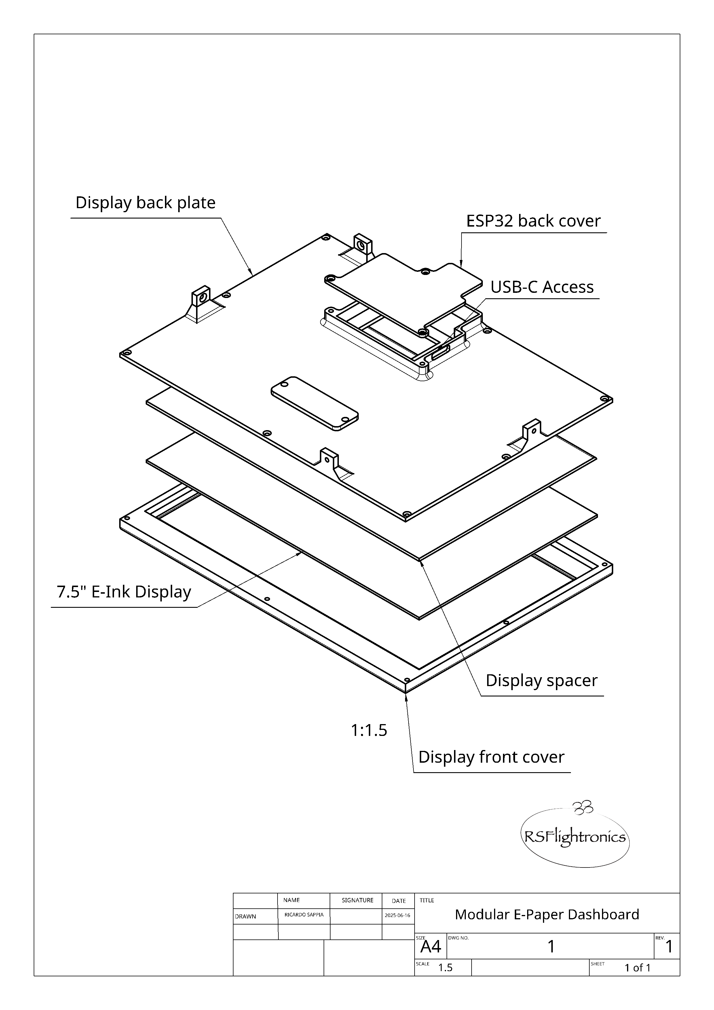
Hardware components | ||||||
| × | 1 | ||||
| × | 1 | ||||
 |
| × | 1 | |||
| × | 1 | ||||
I’ve always loved having useful information visible at a glance — without needing to grab my phone or open an app. That mindset gave rise to my previous project, the Solar E-Ink Weather Station, and now fuels this fitness-focused dashboard.
This time, the motivation hit differently: I was recovering from a running injury, feeling disconnected from my usual routine. I realized I needed something that would keep me inspired and in touch with my progress — even on days I couldn’t train.
This project started with a simple idea: What if I could have my Strava and Garmin stats fusioned and always visible, like a framed photo on my desk? That question stayed with me — and ended up shaping every design decision.
After many late nights of coding, tweaking widgets, and obsessing over e-paper refresh timing, the project began to take shape: a minimal, elegant dashboard that quietly displays fitness stats, weather, and subtle cues to remind me that progress matters — in all its forms.
What started as a personal recovery tool has grown into a modular, customizable system that merges sport, AI, and e-paper tech — designed to live on your desk like a silent companion, always there, always yours.
⬜ About Dashi
This is also the first time I’m sharing the name of the project publicly: Dashi.
The idea behind Dashi is simple — a calm, minimal, battery-efficient dashboard that turns your sports data into a piece of ambient information. No buttons, no buzz. Just quiet motivation, always up to date.
What It Shows
- Latest Activity — distance, duration, pace
- Calendar View — with marked active days
- Weekly & Monthly Summaries — time, km, intensity
- Weather Forecast — Current weather + next 3 days
- Live Map View — when a Garmin LiveTrack is active
- AI Motivation — generated locally based on your context
All in an elegant, silent, always-on display.
How it works:.- Backend (Raspberry Pi + Python/Flask): Pulls data from Strava, Garmin, OpenWeather, and optionally LiveTracking or sleep/recovery feeds.
- Web Layout Editor: Drag-and-drop interface to position widgets visually.
- ESP32 + e‑paper Display: Fetches rendered images (800×480 px) and shows them on a 7.5″ tri‑color screen, then sleeps — for weeks on a single LiPo.
- On rest days, the layout switches to highlight stats and progress.
- On active days, it focuses on the latest workout + weather.
When a Garmin LiveTrack session is active (and only if you've enabled it), Dashi automatically switches into real-time mode. A new screen is generated every few minutes, showing your evolving route directly on the e-paper display.
And it doesn't stop there:
The system adapts intelligently: if nothing has changed, it doesn’t waste energy or update the display unnecessarily. But if something significant shifts — whether in your activity or your recovery data — the dashboard refreshes to reflect it. Efficient, responsive, and beautifully minimal.
Oh, one more thing...
I’ve also added a discreet QR code to the map view. If someone at home wants more detailed tracking or a real-time GPS view on their phone, all they have to do is scan it. The QR leads directly to the Garmin LiveTrack session — no apps, no typing, just instant access.
It’s a small touch, but one that makes a big difference for the people who support you from afar.
Tech Glimpse- Garmin LiveTrack status is detected via incoming email (no API required).
- A fingerprint-based diffing system ensures redraws only happen when context has changed.
- Map snapshots are rendered using Chromium headless.
- The ESP32 only wakes up — and refreshes the screen — if something has truly changed 😉
Something felt missing in the initial versions: a more human layer.
Now, a small fox lives in the corner of the dashboard. When activity happens, it reacts. When it's a rest day, it reflects. When you’re under-recovered, it speaks gently.
These aren’t random quotes. The messages are generated via Gemma, Google’s lightweight open-source model — running 100% locally.
Here’s how the little fox reacted after I went for a quick walk — still injured 🥲, and not exactly well-rested or fully recovered:
Generated prompt: "You are a witty and upbeat fox companion. Barking is not your thing. Speak casually, as if reacting to a friend’s day — avoid sounding like you're fulfilling a request. The user just wrapped up a short 1km hike in 16 minutes. It was cloudy and cool (~16°C). They’ve been told to ease up a bit: current recovery signals are low, sleep was rough, and overall training load has been on the light side. Celebrate the small effort — and offer gentle encouragement to get more rest and find the right moment to build momentum again."
Output:
"Your muscles are thanking you for the hike, but they're definitely ready for some pampering. Take a breather and let the clouds clear your mind!"
Other outputs to the same script:
"Well done on your 4.9km ride in 14 minutes! But listen up, you little champ. Your body is a bit beat, so let's give it a rest for a bit. Relax, recharge, and get ready for another go! "
"Feeling fresh and invigorated? The clouds have parted, the sun's peeking through, and you're ready to chase some adventure! Remember, even a short walk can make a world of difference. So, hop out there and give your body the rest it deserves!"
The messages strike a nice balance — celebrating the fact that I got outside, but also reminding me that recovery matters too... Sleep debt acknowledged… let’s fix that. 🛌
Modular Widgets & LayoutsEverything is based on widgets that receive a shared context:
- Last activity
- Weekly/monthly summaries
- Weather
- Display mode (active vs rest)
Widgets are written in Python and can generate text, graphs, charts, or images. The layout is fully editable via a browser-based interface, with no need to touch JSON.
- A custom error screen was added to give a bit of personality when something breaks 😅
- The ESP32 is being optimized for ultra-low-power operation, aiming to run for months on a single LiPo battery.
My goal is to turn it into a modular, cloud-ready dashboard that can show a wide range of data sources — not just Strava/Garmin.
Layouts and modes
The dashboard currently adapts its layout based on the type of day — active or recovery — and presents a variety of key training and environmental metrics in a clean, low-distraction format.
Each layout is rendered in either light or dark mode, depending on your visual preference.
Here’s what’s already implemented:
Daily Logic: Two Main Layout Modes- Active Day: shows your most recent activity, core metrics, and weather for the upcoming days.
- Recovery Day: focuses on training load evolution and a broader overview of trends and progress.
Monthly calendar
- Displays the current month with active days marked in red, offering an immediate visual overview of your activity streaks or gaps.
Radar chart
- A circular diagram compares time and distance across the last 4 weeks and the current month, helping identify focus areas or imbalance between activity types.
Recovery metrics
- Includes recovery time and chronic load from high-intensity sessions, giving a clearer view of how strained (or fresh) your body might be.
Weekly intensity stats
- Displays the current week's accumulated low- and high-intensity minutes, based on data pulled from Strava/Garmin.
Weather forecast
- A dedicated section shows the next four days of weather for the location set in the configuration file — including icons for clarity.
Each element has been designed with readability on e-paper in mind, using black/white/red only, and keeping typography and layout minimal.
- More layouts and additional visualizations are on the roadmap, but even in its current state, the dashboard gives a rich and actionable overview of your training journey.
This project combines my love for:
- Physical interfaces
- Clean, always-on data on paper ink displays
- Fitness, cycling, and trail running
- Low-power microcontroller projects
- A dashboard for an active day
- A dashboard for a rest / recovery day
- An example of layout editing for active and rest days
- The back of the framed unit with a custom 3D-printed mount
- The display refreshing the immage after fetching the latest update from the backend
This is just the beginning.
The core dashboard is already functional, but I’m actively developing new features and refining the overall experience. Here’s what’s currently in progress or on the roadmap:
Customization & Layouts- Activity-specific views: Different data focus depending on whether you’re running, cycling, recovering, etc.
- I’m evaluating cloud-based options to offload the backend, so that a Raspberry Pi won’t be required for everyone.
- This would make the setup more accessible and allow it to run on simpler hardware (or even mobile-triggered updates).
- I’m refining how Strava and Garmin data are combined to generate meaningful, unified insights, especially when the same activity appears in both platforms.
- The merging process will become smarter and more configurable.
- Other sources are also going to be added!
- A lightweight version of the code (with mock data and basic layout) is in the works.
- Perfect for users who want to try the concept without full API integration.
- A custom ESP32 board is also on the drawing board — the goal is to have it fit seamlessly into the frame, both visually and mechanically.
- I previously worked on deep sleep routines and low-power strategies for my paper ink weather station, and I’m bringing those learnings here.
- Fine-tuning Wi-Fi usage, update intervals, and display refresh cycles to get the most out of each mAh.
This is very much a work in progress.I’ll continue updating this page as new features are added — from backend improvements and power optimization to more flexible widgets and a polished GitHub release.
Feel free to follow the project here or reach out if you’re interested in adapting it, contributing ideas, or just building something similar.
_RH1iUtkcg8.png)


_RH1iUtkcg8.png)
Comments