


My target user is people who don't drive cars to work, essentially people taking public transportation or people who walk to work. If you've taken the BART or Caltrain during rush hour, it can be so packed thats it tough to reach into your pocket and pulling something out without bothering people right next to you. It would be useful to use a smart watch in these tight situations. If you're walking around, having a lot of things in your pocket is an inconvenience, and having a smart watch would be useful and maybe a good alternative to keeping a big phone in your pocket.
Interviews
First interview: 40+ year old, iPhone user outside the Millbrae Bart Station
She had wanted to use her smart phone in her pocket on the BART to look at things she had to do when she got off the BART. The actions she to do so involved taking out the smart phone, swiping in and entering in a pin, locating the reminders app, and scrolling through to see all the reminders left to do.
She wanted a way to view today’s todos on their smart watch. She wanted an app on her smart watch to look at the todo’s for the day, prioritize them, and remove todo’s if completed or move todo’s to another day. What I learned was that when I asked if they could imagine performing the same task using a smart watch, many of the actions mimicked what you could do on the smart phone. When I asked if she wanted to be able to create new todos, she thought it would be too complicated to do on a smart watch unless she were able to talk to it, but it wasn’t a priority; for her, a smart watch is meant to just give information, not add additional information. If she wanted to add an extra reminder, she would pull out her phone.
Second Interview: 55-year-old, Android Phone user walking in the Redwood City neighborhood
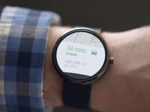
He wanted to use his smart watch to find the nearby location where his friend said he would be located. When I asked, he said that it's inconvenient to pull out the phone while driving or walking around since you're currently doing something that requires some concentration and uses your vision, and so it's distracting to try to locate the smart phone (in his pocket) to use a map app. To find this nearby location, he would hit the power button, swipe in, locate the map app, and type in the destination and when the option popped up, used his current location.
He wanted his smart watch to be to give them a list of nearest restaurants given some specifications and give them directions to it. In his mind, he imagined picking the app on their smart watch, then based on some selections like what type of restaurant, the app will give him a list of restaurants nearby, and when he clicked on one of the suggestions, it would give him more information, but more specifically, will start up directions from the current location. He didn’t want too much information on such a device because his eyes were getting old and it was much harder to see small text. He also didn’t want to type on the smart watch because it was too small, and when I asked if he was okay with talking to the smart watch to specify what type of restaurant, he said he didn’t want to appear talking to his wrist.
Across both interviews:
Both really wanted an extension of a preexisting app on their mobile device and have it on their smart watches. They wanted same, if not similar, interactivity with these apps but scaled down for the smaller display.
*I actually interviewed four people, the first refused to have their picture taken afterwards and the third interview said that smart watches aren’t needed and are an invasion of privacy, so there seems to be some resistance to wearable tech.
The Brainstorm:
- WeatherWatch: An app that displays current weather. Notifications if there's severe weather conditions ahead.
- StopWatch: An app that allows you to time an event and stop whenever. Also a timer that if you set it for after an hour, will go off in an hour. Also, an alarm that goes off at the time you specify.
- Calculator: An app that does very simple calculator functions.
- Music Match: An app that can determine the song that is being played using an integrated microphone and tell the user the relevant information about that song and where to buy.
- Barcode Scanner: An app that using integrated camera can scan a barcode and determine the lowest online price and the seller.
- Todo/Reminders: An app that displays your reminders or todo list, allows you to mark them as complete, move them to another date, or delete, and add todos using the microphone.
- Stock: An app that displays your tracked stocks and displays it graphically or in a list of relevant stock information, and notifies when significant changes to stocks occur, and the closing price at the end of the day.
- Voice Memo: An app that using an integrated microphone will allow you to audio record.
- Next Transit: An app that displays the time for public transit to arrive to you (or how late it is), using information gathered from these public transit agencies (like AC Transit’s NextBus service) and notifies the user when there's a delay or if the transportation is nearby.
- Nearest Restaurant: A Yelp-like app that based on user choices such as what type of restaurant will retrieve a list of restaurants and if the user picks one, will provide turn by turn directions to it.
- Map: An app that displays your current location and allows you to point to another position on the map and give you turn-by-turn directions.
- Cooking: An app that provides directions for cooking food that the user picked. Useful because no longer need to pull out phone for directions.
Favorite idea
Todo/Reminders: Todo lists should be very easy to pull out and readily available (imagine grocery shopping) and this app is something that can fit and work on a watch format and is much more convenient than constantly pulling out a smart phone or even a physical todo list, which is useful for people on the go on public transit or walking around.
The Prototype
This image is the Todo app in action. The cards are what's currently on the screen. The arrows represent screen transitions. The descriptions next to these arrows are what triggered these transitions. For the arrows that have symbols next to them, those are what the user has to press to transition to the next screen. Obviously, I can't come up with every possible scenario, so as the test subject used the app, I created additional cards. For instance, the user clicked the X on the 2nd card, so I drew that quickly, which is why there are two "Feed Dog" cards but one of them has the left arrow missing.
There's also a line with a + on it, which leads to this set of screens:
Those microphone shaped icons were meant to represent the Google voice symbol to signify that the app was recording. I used my own impression for the test user.
On the right hand side is an example of a notification popping up when it reached the time the user set.
Feedback
The two users (neighbors, one of whom is a college student) I tested this on were pretty confused and generally didn’t like it. Pictures on one user using this are located in the slideshow in the prototype section.
First user: The second user was much more imaginative than the first user with my prop watch. However, he was confused at the first screen and not so sure what exactly the buttons were going to do. They did learn after pushing all buttons.
The useful things I learned from this trial:
- The buttons I currently have (+, ->, and x) should be colored, bolder, and made more clear that those are buttons
- Make flicking through the items or removing the items similar to the way Google Now and other apps does cards (flick the card down to remove, swipe right or left to move to the next or previous item)
- Notifications should also follow this trend (having the x on the notification was too confusing).
Second user: This user never used a todo list because they preferred to remember them. Once they clicked on the app, they were pretty confused about what to do next and kept asking me he didn’t know what to do. After telling him to pretend it was a touch screen watch, he mistakenly thought that “Buy Food” meant it was actually going to buy food for him. The rest of the trial went on pretty much like this.
-
The useful things I learned from this trial:
- Prioritize the todo list items (the current implementation adds items chronologically when they were created)
- Add the ability to see the entire todo list instead of just one at a time
- Better buttons signifying finishing a todo item (current it’s just an x)
- This app isn't for everyone, especially for people with good memory.
Other insights:
- Among both users, they were unclear that the notifications would go off at the time they specified when they created the item.
- Among both users, the orientation of the screen was useful in certain scenarios but if they pulled their wrist perpendicular to their body, the text would be sideways. So having orientation change would be useful.
- In addition to all of the changes mentioned above, I think adding a simple tutorial (that many Google apps use when these apps are first launched), would be helpful for the user to understand what’s possible with the app and explain to the user what the buttons on the screen do.

Comments